RWAus19

9DE48DC7-EE6D-4C3D-BF41-553A1B60EC6DLast weekend I had the honour of attending the  Romance Writers of Australia’s 2019 conference held in Melbourne.

As a first time attender I was labelled a “newbie”, and had the opportunity meet many up and coming authors as well as those more established in their writing.

One of the highlights of the weekend was the gala awards night that honoured writers in the RuBY awards. Another highlight was the Fight Like A Girl workshop by Aiki Flinthart.

One of my favourite things to read in a romance novel is a kick ass woman who doesn’t rely on a male hero to save her. Aiki’s talk had so many gems in how to make your writing that much more nuanced and believable when it comes to portraying fighting.
14F9BD14-CBC1-45C0-99A1-0828005C5BC1.jpeg

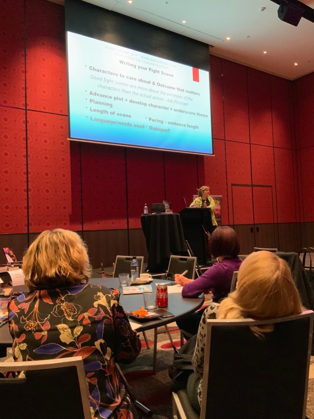
Aiki Flinthart talking to us about what goes into writing realistic fight scenes

I also enjoyed meeting Annabelle McInnes, an author who runs the Cover Crush segment for the RWA. As a cover designer it was great to pick out some authors opinions on covers.

There were many moments over the weekend where I picked up on some advice for authors about covers that I can also vouch for. For example, make sure your cover reflects the genre. Don’t try to look too different or you will confuse and irritate your readers; however, do make sure your cover isn’t identical to what’s already out there. This is particularly important when using stock artwork.

Another highlight over the weekend was the diversity panel where Amy T Matthews (Tess LeSue), Nicole Hurley-Moore, MV Ellis, and Renee Dahlia debated the different elements of diversity and how they are and aren’t being integrated into the romance genre. So many great discussions and questions came out of the debate, which was a really positive sight.

Romance is one of my favourite genres to edit and to design covers for. It’s a genre with a rich history and a diverse readership that know what they want.

Next year’s conference will be held in Fremantle, WA. Can’t wait!

Advertisement

Around the Circle

Recently, I had the opportunity to work on Bob Keogh’s manuscript “Around the Circle”. This was a complex, time-starved project, but ultimately it was a rewarding one.

After an edit (provided by Brian Clarke), I was given the manuscript to begin the design process. Bob’s daughter, Julia, was the engine behind the book and supplied me with many pictures that might go with the text. Some of the images were quite old, and all required careful handling.

I scanned all the images at high resolution and took to editing them so that they would look presentable in the book.

The images would be shown at no more than 19 cm wide in the final design, so the aim was to make them clear at that size.

During this process, I also worked on the cover for the book. At this stage, we had agreed to the specifications of the book (A5, full colour), so I had a rough guide to the size the spine should be based on how many pages I expected the book to end up with. Julia and her family had already drafted an idea for the cover, so I took that idea (shown below, left) and expanded upon it. They had in mind a few particular photographs to be on the cover, so I did my best to include them.

I had also begun to work on the typesetting. Julia had provided me with the captions for the images to go within the book, so I added these, along with the images, into the manuscript. The text was formatted with indented paragraphs. This helped keep the page count down, while also providing a clear direction for readers to follow. The chapter lead pages were kept quite simple, with an elegant formal design the aim.

This slideshow requires JavaScript.

The last piece that went into the design were icon images to go at the end of each chapter. These icons were decided upon by the author and the editor together. Each icon was to encompass the theme from that chapter. I did some research and found some images, either in the public domain, or with a Creative Commons type license that would allow us to use the image. We wanted the images to be black and white icons, a simple decoration. I used Adobe Illustrator to convert and edit the images to their final form for use in the chapters.

Once the design was complete, the family reviewed it, as did the editor, allowing for final tweaks to be made. Once happy, I supplied the final print-ready files to the printer, who confirmed the spine size, and the book was printed.

Julia tells me that they have come out very well, and that the book launch was also a success. I am very glad to hear it.

If you are interested in the book in this blog, please visit https://www.facebook.com/KeoghBob.

Shoutout to Libraries

There something wonderful about libraries. I walked into my local library on Thursday to pick up some new reads, as my bookcase is getting woefully full and there’s no room for any more! I never realised just how important libraries are at sharing information and creating community. While I was strolling through the bookshelves, tilting my head in such a way as to require a heat pack later, I discovered the library’s events booklet. When I say booklet, I really mean book, this thing was thick. There were free activities for readers of all ages, and even some for non-readers – craft days!

When I look a round a library I notice just how many people have had the same idea that day, to get out and find a good book to take home with them. Everyone is oddly polite in a library, shuffling chairs, saying ‘excuse me’ very quietly and sidling past you in a row, putting books back exactly where they came from.

When I look back to six-year-old me, I don’t think she would understand just how magical the plastic card in her hands would be. It opened up more worlds than could ever be imagined – for free.

Without libraries, I don’t think I would be where I am today.

So let’s all give a little shoutout to our libraries today – maybe even head in and find a new world to discover between crinkled pages.

-SJ